
When More Wasn't Better: The Cluttered Design of 1990s Hockey Cards
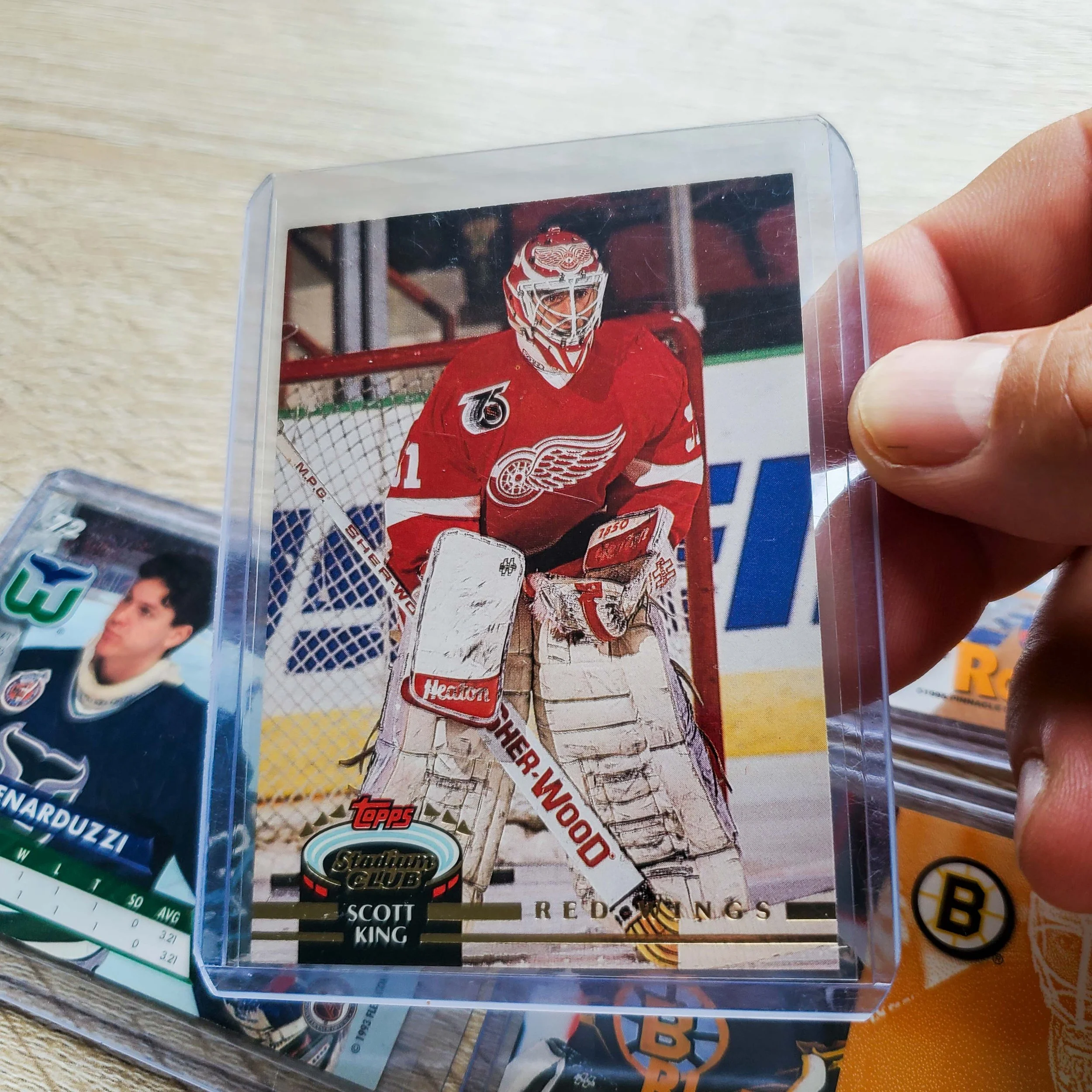
If the 1980s were defined by simple borders and clean photography, the 1990s went in the opposite direction. Hockey card manufacturers seemed determined to prove that more was better. Foil stamping, holograms, dual overlays metallic logos, exploding graphics, oversized fonts often competed for attention on the same card. Instead of complementing the player, the design frequently overwhelmed the photograph.
The decade was driven by competition. With companies like Upper Deck, Score, Pro Set, Pinnacle, Fleer Ultra, Leaf, Donruss, and Stadium Club all fighting for collectors' attention. Every release tried to look louder and flashier than the last. Unfortunately, that often resulted in cards that now feel cluttered, dated, and almost kitsch. Many designs captured every graphic trend of the 1990s, making them unmistakably products of their time.
The photography itself was often excellent but used in full-bleed action images. Those photographs were frequently buried beneath layers of foil, graphics, and decorative elements that distracted from the player rather than showcasing them.
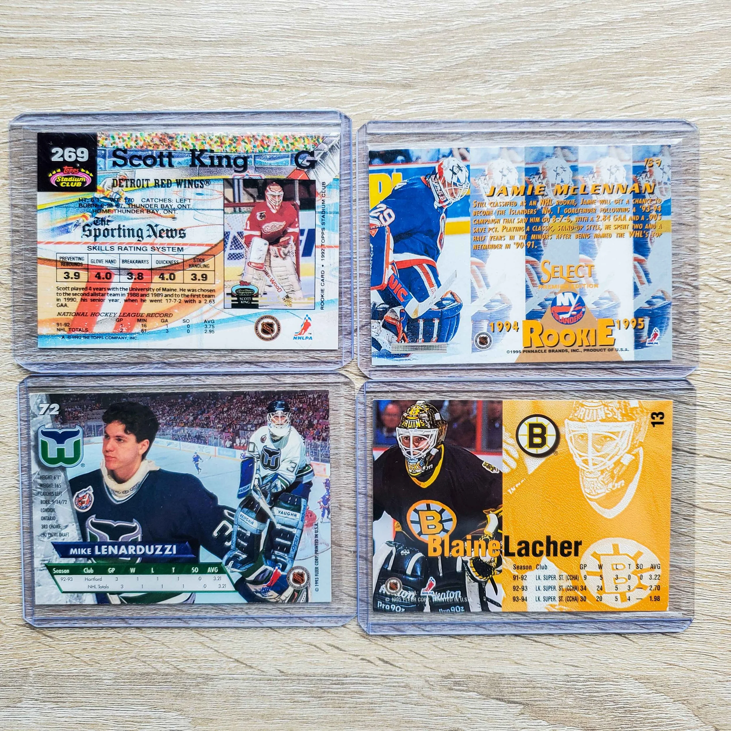
The Terrible Design of 90s goalie cards
The backs of the cards followed the same philosophy. MORE, MORE and MORE.
Manufacturers packed them with statistics, trivia, biographies, multiple photos, career highlights, and promotional graphics. While there was certainly plenty to read, the layouts often lacked the clean organization found on cards from earlier decades.
Today, 1990s hockey cards remain a fascinating chapter in the hobby.
Their designs may not have aged gracefully, but they perfectly reflect an era when manufacturers believed every new set had to be bigger, brighter, busier, and more elaborate than the one before it. For better or worse, few decades have a visual identity as unmistakable as the hockey cards of the 1990s.
